Introducing FleXss: CSS and Flexbox-style UI for Unity
Meet the renderer-independent framework bringing stylesheets, design tokens, and modern layout workflows to Unity UI.
Want a universal stylesheet and a modern layout system for Unity UI—without giving up AOT-friendly builds or the components you already have?
FleXss is a renderer-independent UI framework that brings CSS and Flexbox-style authoring to Unity. It grew out of more than ten years of work across games, industrial applications, and VR, and from one recurring frustration: every Unity project seemed to need its own styling and layout layer.
Want a free set of FleXss licenses for yourself or your studio? Apply for the FleXss closed beta. Accepted testers will receive lifetime access to the internal beta and public release branches of FleXss CORE.
One authoring layer, whichever renderer you use
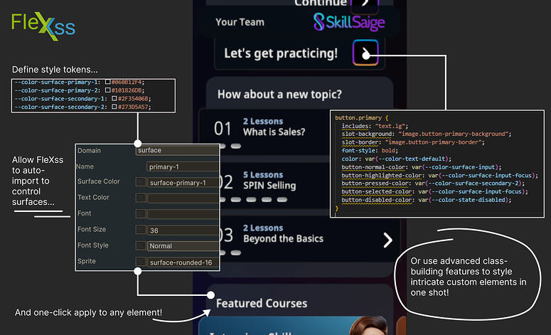
FleXss sits above Unity UI systems such as uGUI and UI Toolkit. It provides a shared authoring and adapter surface, so your design system does not have to be rebuilt every time the renderer or project changes.
In practice, that means you can build UI in the way that suits your team—by hand in the editor, through code, or with a mix of both—and still get the benefits of a modern design system:
- Design tokens
- Reusable classes
- Stylesheets and themes
- Stable Flexbox-style layout for uGUI
- Programmatic styling and animation
- A renderer-independent API surface

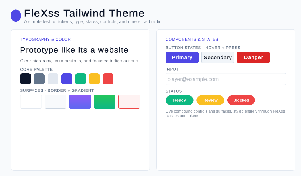
You can even prototype with web-style utility classes if that is how you think. The example below was built entirely in uGUI in about ten minutes, with token- and class-driven styling instead of one-off values.
Built in real projects
One of the earliest FleXss use cases was Reliquary. An early version powered its programmatic UI animation system, including interfaces rendered in world space.


Today, FleXss powers SkillSaige, a communication-skills game and learning management system. Jade Ember Studios provided development assistance and mobile-version publishing support. Thanks to FleXss, the enterprise edition supports screen readers and other accessibility features across the institutions and platforms it serves (and coming soon to the free-to-use mobile version as well!).
These projects shaped FleXss into a practical production tool rather than a clean-room experiment. The public package is the result of extracting that battle-tested system, tightening its API, and making its assumptions visible.
Bring the UI you already have
Adopting FleXss does not mean rebuilding a mature uGUI project from scratch. Its conversion tools can inspect prefabs, scenes, and layouts, then help convert them either piece by piece or in one pass with manual review and correction.
Select an object and the FleXss CORE context window detects compatible primitives from the built-in library or your own custom components.
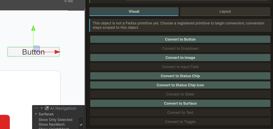
The generated setup is also repairable. If a required piece is removed accidentally, the Repair action can reconstruct it.
What the closed beta will test
The uGUI implementation is already working and actively used inside our projects. The first external beta focuses on the core slice we intend to ship publicly, and on finding the assumptions that only made sense inside our own work.
We are looking for feedback on:
- Real-world project integration
- Flexbox and layout edge cases
- Custom component integration
- Theme and stylesheet workflows
- API cleanup and diagnostics
- Documentation and examples
- Migration from existing prefabs, scenes, and layouts
Accepted testers will join the FleXss Founders program and receive lifetime access to the internal beta and public release branches of FleXss CORE through a dedicated Git repository.
Apply to join the FleXss closed beta. We will share implementation notes, screenshots, examples, beta changes, and progress toward release here on the Jade Ember site.
And yes, we are also using FleXss on an upcoming spare-time project specifically to find new ways to break it. The parts that are not ready to show are staying blurred for now.